Artificial Intelligence
is mimicking art
At Dubai Data Science Meetup
At Dubai Data Science Meetup

You reached Flavio's blog on CRAZYDATA.
The title Picture is what happen to Data Scientists when they go overboard on the issue of Visualization.
We, common mortals, just limit our decisions between whether to use a Pie Chart or a Bar chart. We even get totally stacked when we have to change the default colors of our Excell charts and most of the time we end conveying our messages against common narratives.
For these reasons the last Dubai Data Science Meetup, hosted at CAREEM headquarters has been a real wake-up call.
If someone can inject pure Art into a sketch - and even sketched with a poor hand - we, as practitioners of the art of crunching data, should take much more seriously the color palet of our charts.
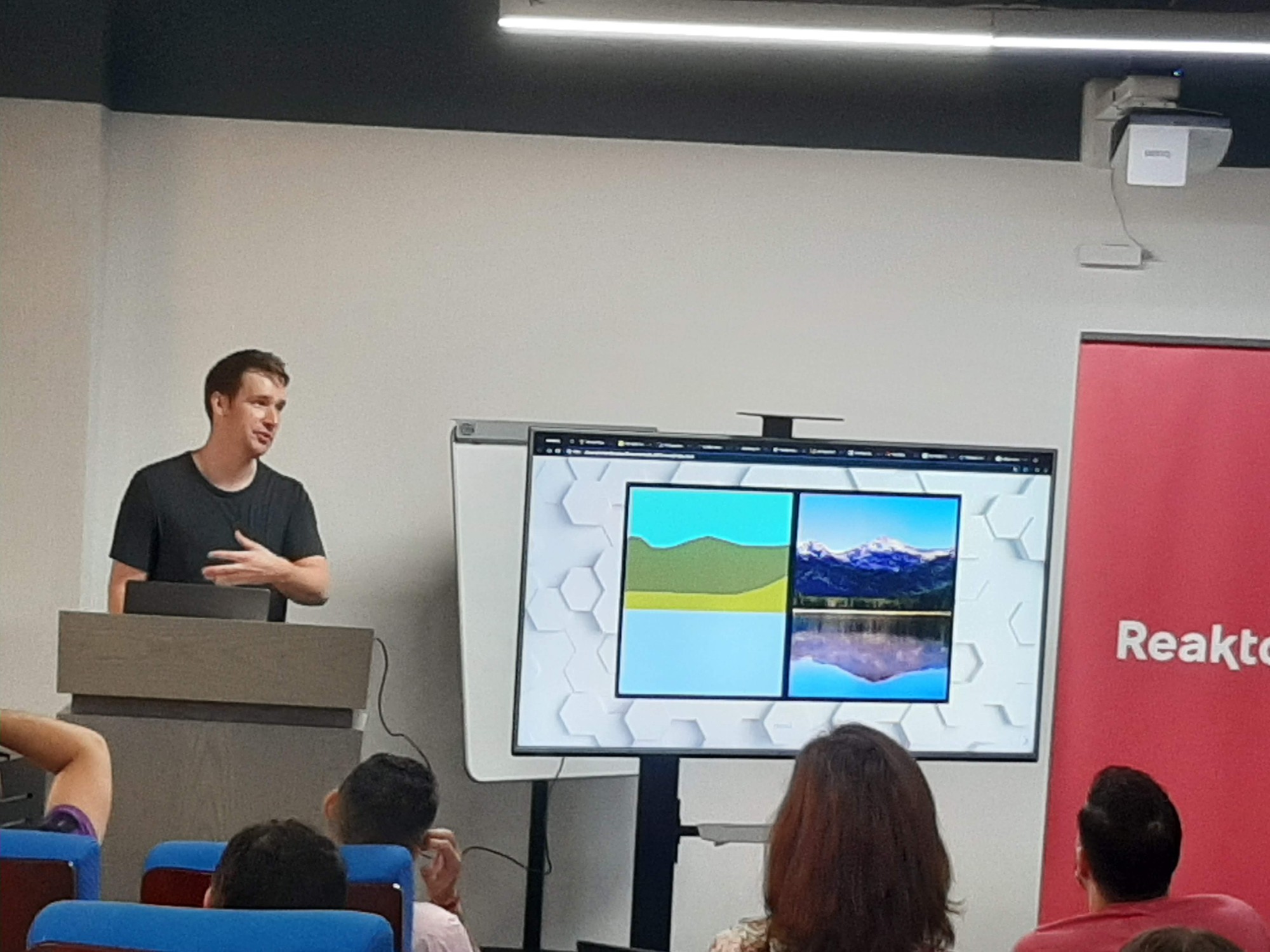
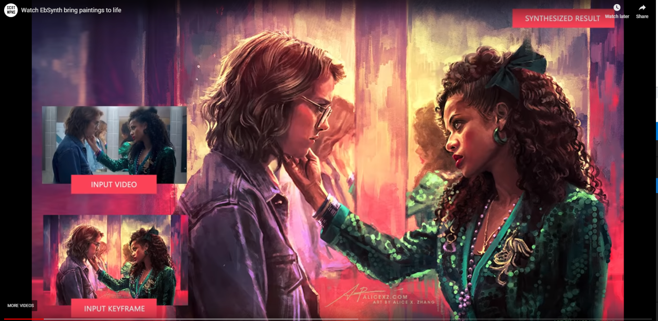
This is Richard Brooker → showing how a few stain of colors on the left can be transformed in a beautiful alpine landscape on the right.
This trick it's only one of the few examples Richard has brought to the audience attention, in how AI can twickle reality using Style Transfer as well as other generative art algorithms and models.
Staring at this video with its kaleidoscopic colors show, excited the room just in time for a reality bath on how bad is our ability to convey the simplest information.
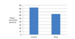
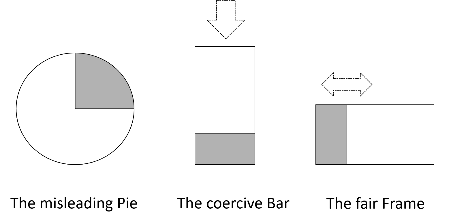
We love pies. Our mom taught to love pies since we were into cradle. And suddenly we discover that pies are the evil of any Data Visualization attempt to convey a message.
We not only shall abandone pies. Actually we should embrace more "angular" types of data representations. A simple couple of bars, with their clear indication of relative power, are not even close to what is really needed: a rect-angular shape.
The areas represented in a rect-angular shape, is not only more easy to be weighted in terms of power, but also avoid that sense of dominance that a pure stacked bar can convey.
We were just so happy to have finally given the freedom of a democratic view to our dataset, that Jose Berengueres (https://www.linkedin.com/in/berengueres/) just ripped into trash our Male-Male-Male Data Scientists ego dumping our favorite super-heroine for wearing a gown too short for scandinavian standards.
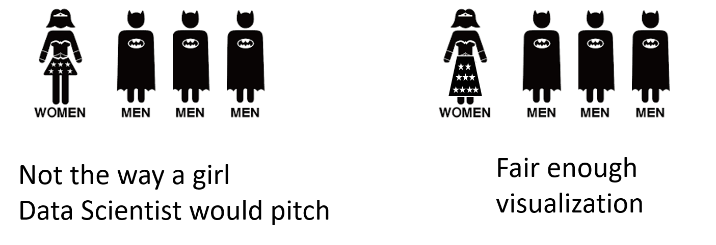
It is at this point that all of us (with the exception of the girls - they already knew it ) understood that we need a better way to storytelling.
Thanks God we can learn from the masters:

No, not these masters. Here we just learn that a simple data-point can be wrapped into a story that may resonate with a diffused narrative, just to activate a no-brain call to action.
This is the power of good stories. As long they resonate with the listener narrative they are taken for true, without data-questioning,
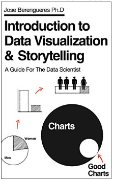
If we want to really understand the way Data can make a Story, our only hope is to dive into the secrets of true storytelling with data into the Jose book:
it's a great one, funny and even cheap. just few bucks and you can get it on Amazon here: →
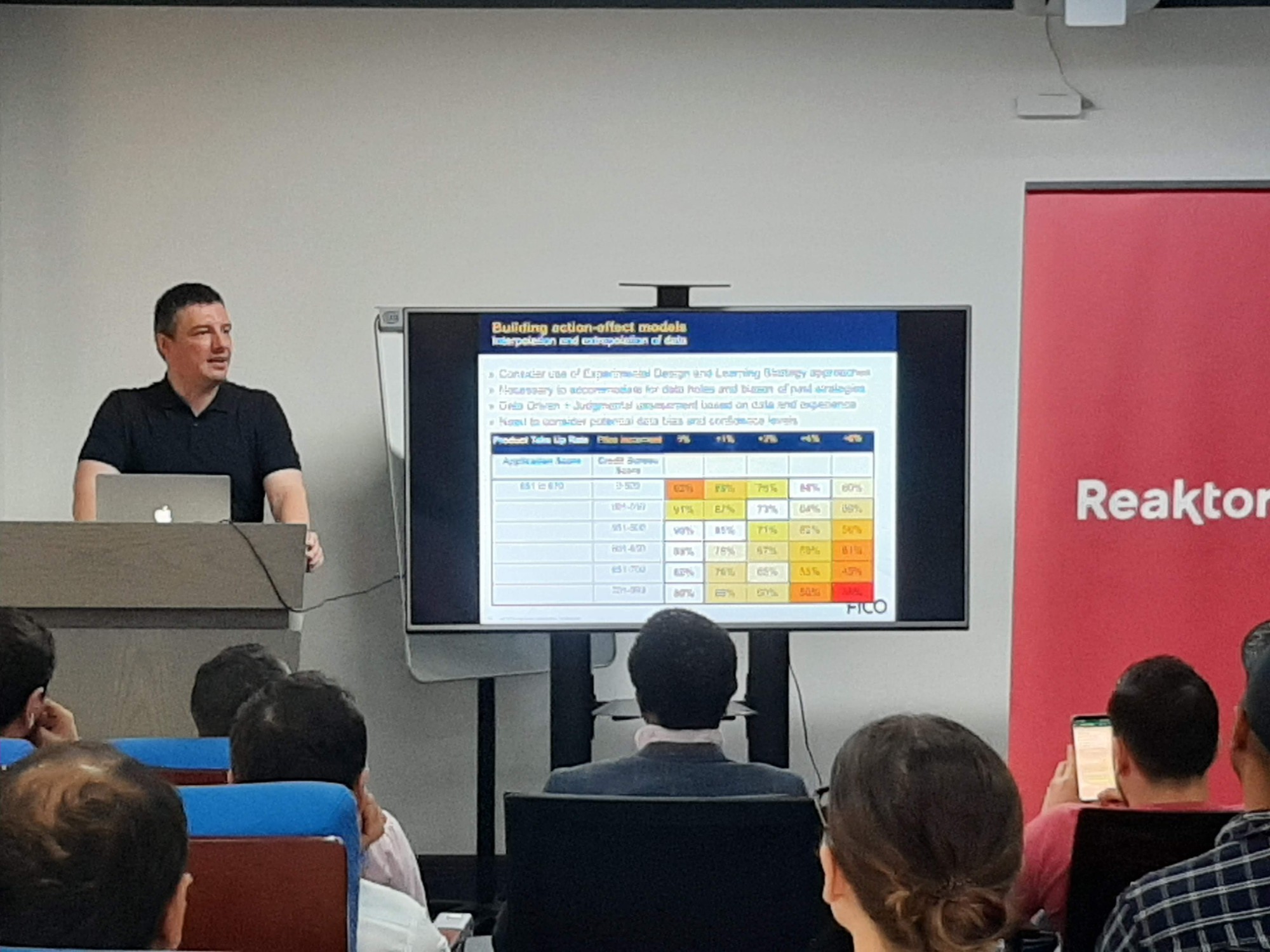
This last was too much. We shall confess. After all that Art, colors, beauty and talks, we just needed the reassuring ground of pure old and faithful machine learning.
But when we were all well inside the intricacies of decision making optimization of credit card loans awarding, we discovered that even here, delivering the right message is not as straightforward as we hoped.
Yes, we can define an "optimal" set of inputs for our decisions processes:
Nevertheless, the Key Decision Maker ( in this case the CFO of the Bank ) will use her personal gut feeling to select the sweet spot of the next company's strategy among the one proposed in a cartesian chart under our "Efficient Frontier".
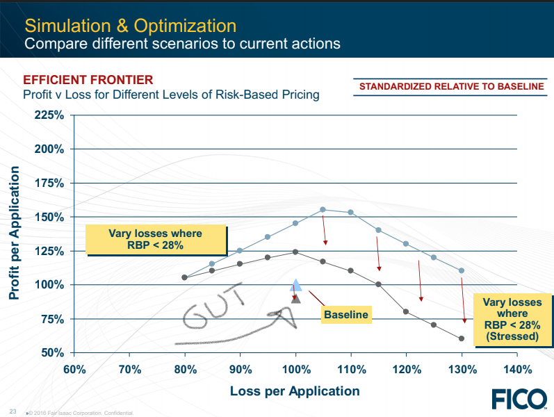
The most incredible part for a Data Scientist could have been to learn that she was actually right, as the data collected on field afterward by Yuri Chekalin → and his team demonstrated.
We can be great Data Scientists, we can be great storyteller, but humans still brings valuable context and knowledge to the final decision making.
For the brave of us that dared to stay after the lunch, we were given a pass or fail test on data visualization best practices by Pavankumar Gurazada →
Why to visualize a Dataset and How to visualize seems to be still a non-framed discipline.
Actually the best practices are evolving over time (probably with the growing understanding by Data Scientists of their own limits over "pitching" a clear message ) and Real Scientists are trying to understand the effects of many important parameters on the effectiveness of data visualization.
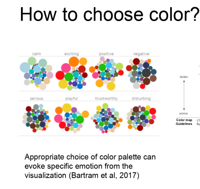
So we learned that Colors Matter:
And till here... nothing new under the sun...
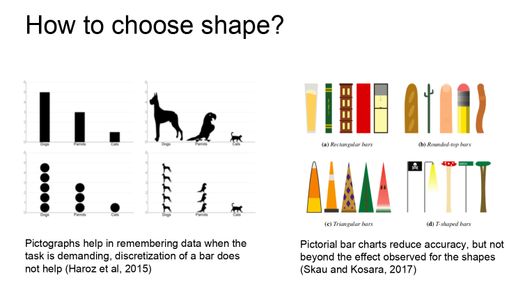
But we also discovered that someone is experimenting the effects of choices not as much obvious, as for example: using parrots, dogs and cats as a substitute for our "bread and butter": the barchart
We learn a lot in this Meetup, as usual. We learned that Data Visualization is quite an Art. It takes learning best practices, injecting some storytelling, avoiding the traps of personal and cultural bias, bringing "guts" into the game...
It takes time to practice, but we cannot avoid it, if we want to convey our messages to take informed decisions.
Flavio
(This post has not the goal to summarize all the contributions given by the presenters and the great questions from the audience. It just want to give some flashes of the great topics, hints and ideas that were shared, and invite AI practitioners but also business owners and managers to take part to the next one. The friends at Dubai Data Science Meetup are doing a great job and this post is a way to say them Thank You!)
